9 minute read | 14/09/2023
We have just announced our latest rebrand to SPARK TSL®! To celebrate the launch of our new brand, we will be diving into the past. Today, in this exciting journey, we will be delving into the visual elements our brand evolution that dates all the way back to 2003. Join me as we take a captivating stroll down memory lane and truly grasp the significance of branding and brand association.
Branding is not just about a name change; it encapsulates the essence of our vision and the direction we are heading in. Our rebranding to SPARK TSL® solidifies our commitment to revolutionise patient care and ensure that Hospital Trusts in the UK are at the forefront of digital transformation and connectivity.
- New Brand, New Visuals
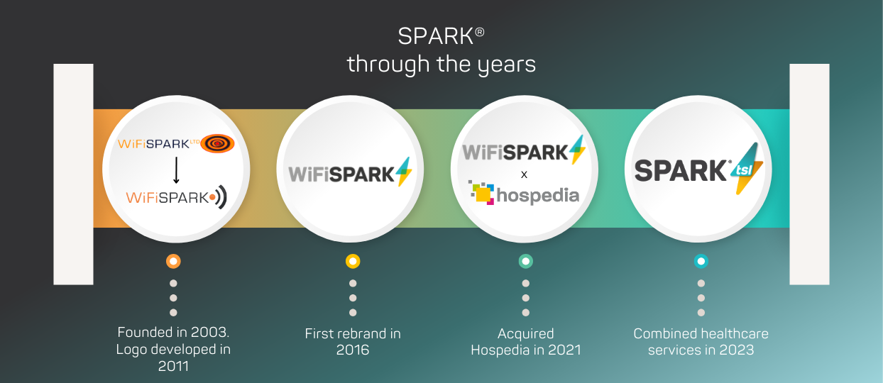
- WiFi SPARK to SPARK TSL®. A Brand Journey
- The Beginning of WiFi SPARK
- The Evolution of WiFi SPARK
- Re-defining to SPARK TSL®
- Goodbye Hospedia
New Brand, New Visuals
Our new brand was created by Optix Solutions who did an excellent job in re-working the previous branding and adding a creative spin. We have new hero images, colours, brand guidelines, backgrounds, and most importantly, a refined logo. The re-brand has been in the works since January. Several iterations later through collaborative feedback, we can finally announce SPARK TSL®. We’re very excited about this change because of how it looks and how it will bring WiFi SPARK and Hospedia under one name. It doesn’t only unify the brands and products, but our employees as well. Employee contracts will have all the same conditions, growth and development will align as well as superior benefits.
This new looks creates a strong brand identity that isn’t dissimilar to our last re-brand. This makes it easier for customers to still recognise that SPARK TSL® was WiFi SPARK. Be prepared for a subtle but impactful change in our literature, resources, website and videos.
WiFi SPARK to SPARK TSL®. A Brand Journey
The Beginning of WiFi SPARK
WiFi SPARK was born from a simple idea. Matt was a keen sailor and he wondered why there was no WiFi at Marinas. Matt then went out and founded a WiFi Company with our first customer being MDL Marinas, in 2004. It all started from a problem that needed a solution, and ultimately, that is the very ethos of WiFi SPARK. As a start-up company, there wasn’t the budget to splash out on the initial creation of WiFi SPARK’s branding. Therefore, our first logo was made in house. From 2003 till 2009, our logo looked like this.
.png?width=350&height=78&name=MicrosoftTeams-image%20(18).png)
The name itself represented the company as a whole. If someone required WiFi at their large enterprise, they knew where to go. As leading WiFi specialists, we kept the 'WiFi' element of our brand at the front of our company name. Between 2009 and 2011 we removed the image on the far right and changed our tagline to Wireless Networking Solutions. In 2011 this first logo was improved upon slightly.
![]()
The writing on this version of the logo is rather boxy to show the security of our WiFi. It looks strong and secure.
Our brand is focused on delivering customised solutions that enhance the WiFi user experience for businesses and their customers; ensuring they have access to the best possible connectivity and service. WiFi SPARK was constantly evolving based off customer's needs. They wanted a fully managed service, so we deployed our first Cloud-based WiFi platform, full NMS and 24/7 helpdesk.
Customers wanted to understand who was connecting to the WiFi, how many sessions there were and more. This brought about the creation of SPARK® Analytics. Very quickly, WiFi SPARK was offering more than just WiFi. By this point, we were providing our solution to healthcare, rail, stadiums, retail, marinas and private spaces. The evolution of WiFi SPARK and a focus on the healthcare sector called for a rebrand. Therefore, in 2016, WiFi SPARK rebranded again. This time, we were going to do it right.
The Evolution of WiFi SPARK
In 2016, we introduced the new branding for WiFi SPARK. I think it’s safe to say that this was a dramatic improvement from the first logo.
![]()
It still creates a strong presence, but has an elevated sense of style and character. The swap from the WiFi symbol to our custom bolt defines us as a unique brand and not just another WiFi company.
Along with the logo, we had various brand assets. This included a re-design of the bolt logo which were used across our website and other collateral designs. We also included the use of triangles and based the colour scheme around blue, yellow, black, white and grey. Our brand became much more defined and recognisable.

WiFi SPARK was already leaning more towards the healthcare sector when we acquired Hospedia though the help of our parent company, Volaris. In fact, we were competitors of Hospedia. They provided 50 thousand bedside units across 100 NHS Hospitals providing entertainment at a cost to patients. These units were initially installed for free to the NHS and came with a free managed service. We provided WiFi and a Bring Your Own Device (BYOD) solution that provided entertainment and engagement resources, free of charge to the patients. Patients and visitors could use SPARK® with their own smart device and be easily redirected to live TV, the hospital radio, NHS resources, their charity and more.
With the acquisition of both WiFi SPARK and Hospedia, we now proudly hold the largest presence in the NHS when it comes to patient engagement and entertainment platforms. The acquisition of Hospedia in 2021 and our dedication to the healthcare sector called for another rebrand.
Re-defining to SPARK® TSL
In 2023, the birth of SPARK TSL® marked the integration of WiFi SPARK and Hospedia into a single entity. While WiFi SPARK had established a positive reputation, Hospedia had yet to achieve the same level of recognition. It was important that we took ownership of Hospedia by incorporating them into our brand name. The only way to move forward and past the bad reputation of Hospedia was to start with a brand change.
For the rebrand, we wanted to remain recognisable as WiFi SPARK. The changes made are subtle but effective and fresh, giving a more premium feel. We have fully embraced the vibrant blue hue and toned down the presence of yellow, giving our brand a more refined and sophisticated appearance. In addition, we have introduced new shapes such as triangles and trapezoids, adding a touch of modernity and creativity to our visual elements. Moreover, we have meticulously curated custom backgrounds and captivating hero images to create a distinct and polished aesthetic for our brand.
We believe this change is important for our brand identity and reputation, as well as setting us apart from the crowd. We have Optix to thank for this rebrand and the amazing work they have done to encapsulate what SPARK TSL® stands for within our brand appearance.
Goodbye Hospedia
It is widely known that Hospedia has garnered a negative reputation over the years. While they initially installed all the units and equipment free to the NHS two decades ago, it came with a catch - patients had to pay for most entertainment that was available on the units. In today's modern age, this patient pays model is considered outdated. The primary criticism of this system revolves around its high price point.
After the acquisition, WiFi SPARK was put in a difficult situation regarding the inability to lower the price. The current model not only pays for the remote monitoring, maintenance, 24/7/365 support and health and safety checks, but the parts that need replacing, cost of transporting them, the Area Service Engineers that repair the units, and more. The only way to reduce the cost, or remove it completely, is for the Trusts and their Charities to part or fully fund the service; or upgrade to SPARK Fusion® .
Choosing to invest in the upgrade to SPARK Fusion® is a strategic and beneficial choice for Hospital Trusts. Not only does it offer free entertainment to alleviate patient boredom and keep them engaged; but it also brings forth a wide range of apps that offer numerous benefits to patients and yield a high return on investment. This upgrade goes beyond just providing entertainment and truly enhances the patient experience. Just read our blog. At the end of the day, healthcare is all about the patients. Improving their experience is a top priority for NHS Trusts and SPARK TSL®.

Related articles
 Industry News and Insights
Introducing SPARK TSL: Connecting Hospedia & WiFi SPARK as one
We are thrilled to share some momentous news that marks a significant turning point in our journey. In 2021, ...
 Company News
SPARK TSL's VIP Demonstration Day
With hospital restrictions still in place due to the aftermath of COVID-19, our account managers in sales ...
 Company News
Improving Healthcare: SPARK® TSL Demonstration Day Insights
SPARK® TSL hosted their first demonstration day back in March. Hosted by Francesca McPhail, Healthcare ...
75% of patients want digital healthcare services
So let’s work together to give it to them, all while optimising NHS processes.
